Low show
By David on Feb 2, 2011 in Music
To celebrate the release of C’mon, LOW are hitting the road. Beginning with an intimate show at St David’s Sanctuary at SXSW. Other highlights from the band’s upcoming 28-date run include LOW’s first headlining show at Barbican in London and a performance at Radio City Music Hall with Explosions in the Sky.
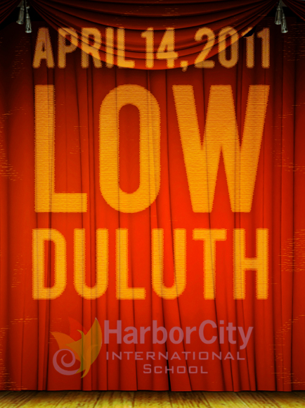
LOW – DULUTH SHOW
Thursday, April 14, 2011
Harbor City School Theatre


I’ve asked this many times of many people, but I’ve never gotten a reply. Why do so many people capitalize all three letters of LOW? Shouldn’t it simply be Low? Or does LOW actually stand for something?
Anyone who would set text in all caps would steal sheep.
On promo pieces, whatever’s clever. As text, “Low.”
Sorry, David, if this seems like quite a bit of complaint for a promo post. I’ve asked before on other posts, and never received an answer.
For those unawares, the latest release from low* is now available for presale and along with the purchase you get a link to stream the album. I’m on my third listen and it is very, very good. IT can be acquired from the Sub Pop website
* See how I didn’t capitalize any of the letters… haha!
I think when you have such a short name, capitalizing all of the letters provides nice balance which makes it easier to work with on the design side of things.
I understand why someone would do it in a poster. I just don’t understand why someone would do it while typing a blog post.
Another example of this: People always fully capitalize the title of the TV show LOST. There are probably other examples, too. It’s a strange phenomenon. Well, strange to me, at least.
BARRETT CHASE. Yeah, that was weird.
goddamn proofreaders wreck all the fun.
The text was copied from chairkickers.com/news.
It’s probably a “mood dependent” decision. Maybe they’re YELLING?
ALL CAPS should almost always be avoided and rarely work--but in this case, with a short word, on covers and posters and the like it’s fine and fits in well with the rest of the piece. Book and CD cover designers get to break all sorts of “rules” regarding punctuation, etc. to create the affect they are after—as long as it doesn’t compromise readability. After all, why bother designing a funky poster if the message isn’t clear to the intended audience?
Lowercase letters were created--along with spaces and punctuation--to make words easier to read. The boxy, horizontal look of A SENTENCE SET IN ALL CAPS is actually more difficult for the human eye to scan and read, and though it may seem illogical to some, using traditional UPPER/lowercase allows you to make the type size bigger than if you had used ALL CAPS.
There are, of course, exceptions. Titles of film treatments, for example, are set in ALL CAPS. I’m sure there are others.
yea … well what about all the superfluous serifs on this web site. It’s a waste of electrons. What, are we having to line up type faces in a screw press here? This is the intewebz damn it! Sans the serifs and join the rest of us swiss in the futura. BTW alright for HCIS finally getting a low show! That should be an intimate night. Who’se doin lights?
The serifs are unsanned because we like our electron consumption to be conspicuous. Next, you’ll be crying for monospace! Get your Helvetacommie ass to the back of the bread line, while we let the serifs wave, like true Americans, for the sake of the children.
Won’t somebody PLEASE think of the serifs?
Barrett, you are a true patriot! Baci, apparently the space between your ears has been kerned too tightly — I’d love to know if your talented graphic designer spouse agrees with you.
Actually, a nice combo such as a sans serif headline font and an old style (“serifed”) body font provides a nice visual contrast. So, really, can’t we all just get along?
While we’re griping about typography here, I’d like to drop a slip in the PDD suggestion box. The “Recent Comments” list on the top left: The vertical space between list items is the same as the leading of any list item that breaks to multiple lines, making it very difficult to scan and read the list. Tighten up that leading by a couple pixels and it will do wonders for legibility.
Nerds
BWAAHAHA I like that we all love Low so much that we thread jack to talk about typography. BTW, I’m all Fixedsys all the time. GOOOO Low! Go Go Go! and Go, HCIS!
Oh and you ludites are allll wroong on the serif thing. IT’s b/c your decrepit eyes require guides to the next character. AN OUTMODED METHODOLOGY of information consumption. Serifs are chaotic and extraneous! I’m so serious about this that I challenge you to …um…some elitist and obscure typographic battle! I suppose this will occur at Carmody and involve beers and Lucinda Console. I know a graphic designer debate!! Hells Ya!! Who is in? Pub Debate: Serif or Sans Serif! GAUNTLET!
No, B-Man: Type Geeks. Proud ones.
Speaking of low, Baci, is that a descender in your pants or are you just sad you’re not one of the cool, pro-serif kids?
Serif v. Sans: I vote both!
I find the all caps helpful when I see/use LOW in print to recognize that it is not a descriptor/modifier. This is true also with LOST. Probably should be implemented whenever somebody names their project any adjective.
Okay, I’m just excited that Low or LOW are playing in Duluth again & have a new album